By Maria Vogel
Looking at Victoria Tentler-Krylov’s vast illustration portfolio, you would think that the Russian-born, New York-based artist fell into the field naturally. However, Tentler-Krylov’s professional journey began in a different creative arena: architecture. It seems as though dreaming up three-dimensional spaces and dreaming up illustrative worlds are not so far off from one another. Here, we speak to the artist—and winner of the BHS Creative Challenge—about her creative journey and the artistic through lines of her life.

Victoria Tentler-Krylov.
What was your road into entering creative fields?
I have been drawing and painting since age two! My favorite thing to do as a child was to read picture books and then draw my own versions of the illustrations.
How did illustration become a part of your professional life?
I loved my career in architecture but continued to draw and invent picture book ideas, and eventually got an agent and contracts with publishers. I saw this as my opportunity to switch gears and focus on illustration full-time.
After I began working on picture books, I started to get offers for commercial editorial illustrations that are more geared towards adults. I love this work—it’s very different from picture books and gives me the opportunity to express my sense of style and sophistication.
How would you describe your style of illustration?
My style is somewhat traditional and realistic, but also slightly stylized. It’s important to experiment with different aesthetics and techniques—that’s what makes you grow as an artist.
I have always been in love with the possibilities and unique qualities of watercolor. My work is based in watercolor, but with a certain retro sensibility that comes from studying mid-century artists and illustrators. I also use digital tools and layer them into watercolor—this often results in crisper, more precise images than watercolor alone. I like the combination!
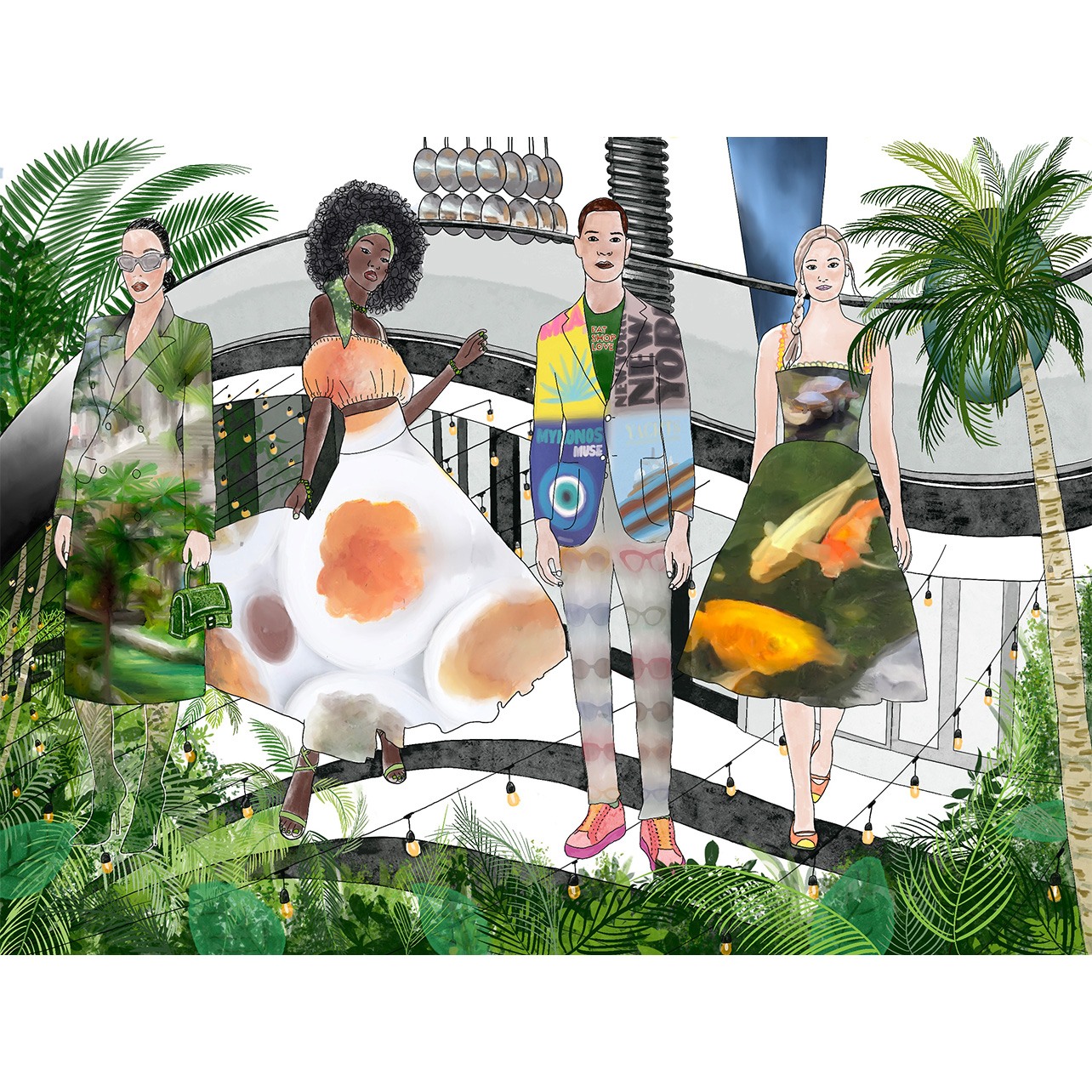
How did your winning illustration capture the spirit of Bal Harbour Shops? What emotions were you looking to convey?
I was very inspired by the idea of fabulous fashion in a tropical environment, with all those wonderful lines and colors echoing each other. I also recognized an opportunity to play with [the water’s] reflections to create an unusual angle. I hope that the image conveys a sense of lightheartedness, festivity and an inclusive and diverse celebration of creativity, style and color. I also like to imagine that, through the image, one can feel the breeze and hear the sounds of music, splashing water, rustling palm tree leaves, laughter and excited conversation.
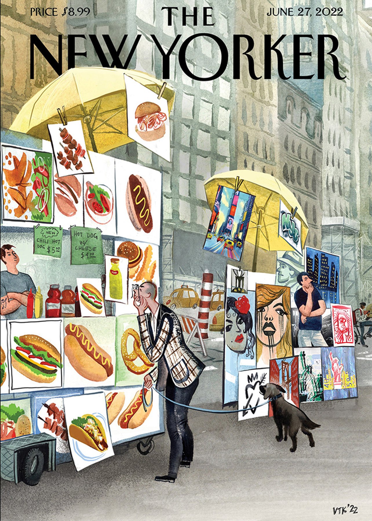
Tentler-Krylov’s June, 2022 New Yorker cover.
You had another big moment recently with the publication of your first New Yorker cover. Can you tell us about that illustration and what the moment meant to you?
To me, New Yorker covers represent an artistic canon of their own. When I learned that my illustration idea was accepted, it was definitely hard to believe that it was really happening. That illustration of the street food and the street art carts side-by-side encapsulated how I feel about New York; there are so many beautiful spaces and buildings, but what I find even more compelling are the mundane sights, like newsstands, hot dog carts and or street vendors. The illustration was meant to be funny—a lighthearted moment among all the somber news that surround us daily.
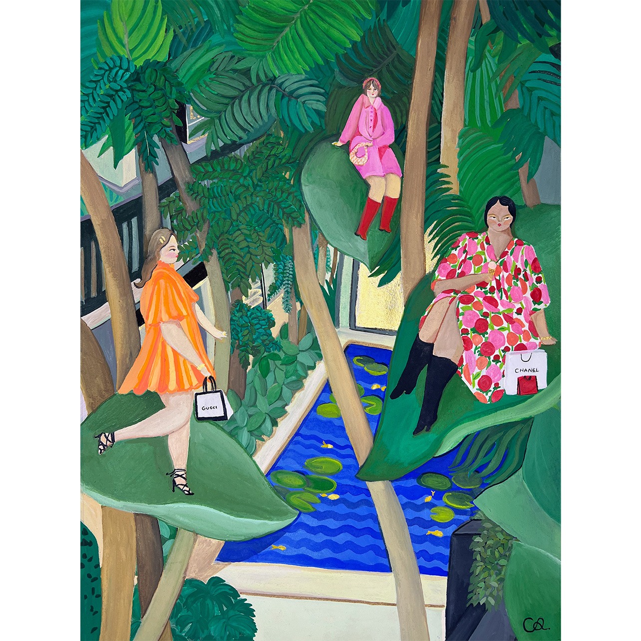
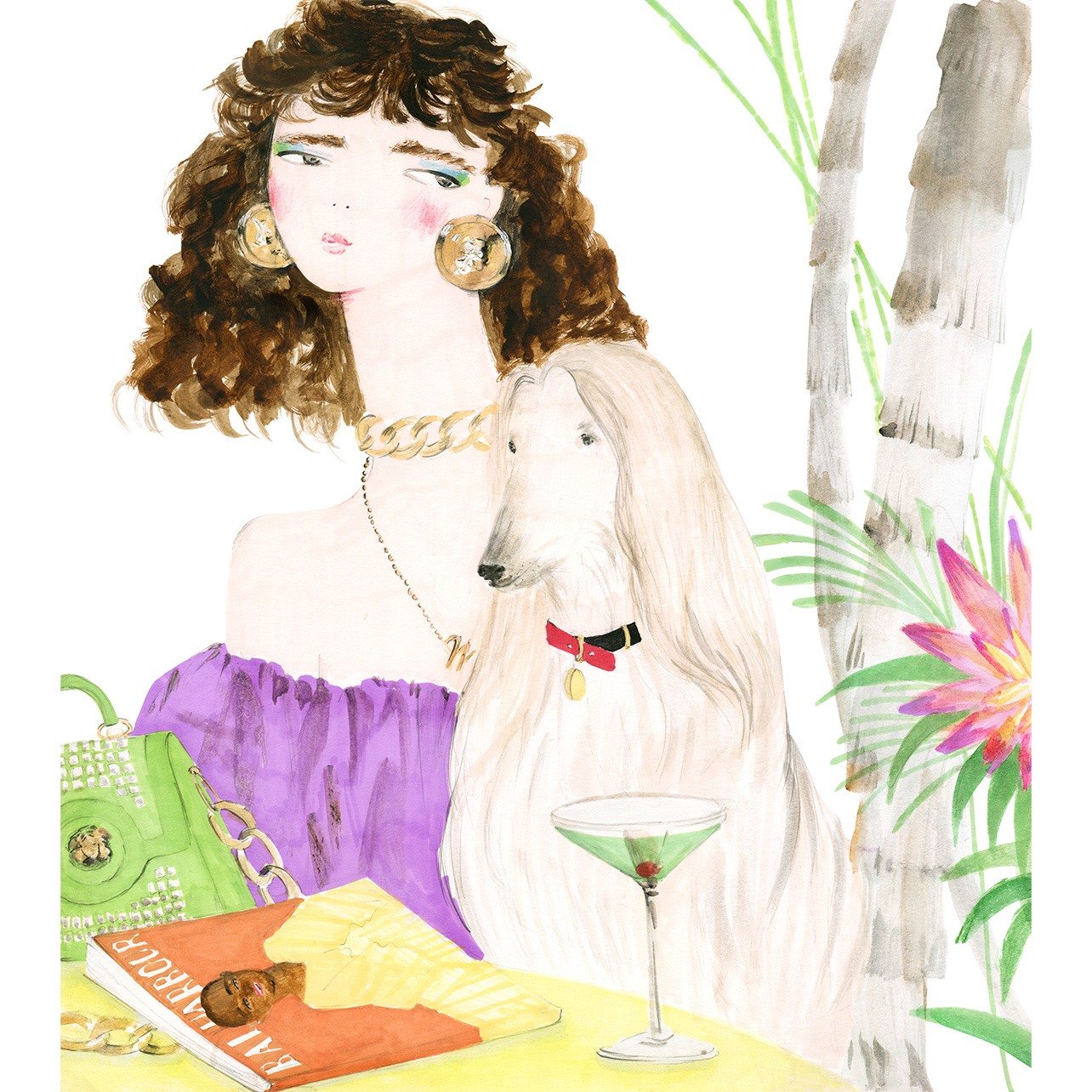
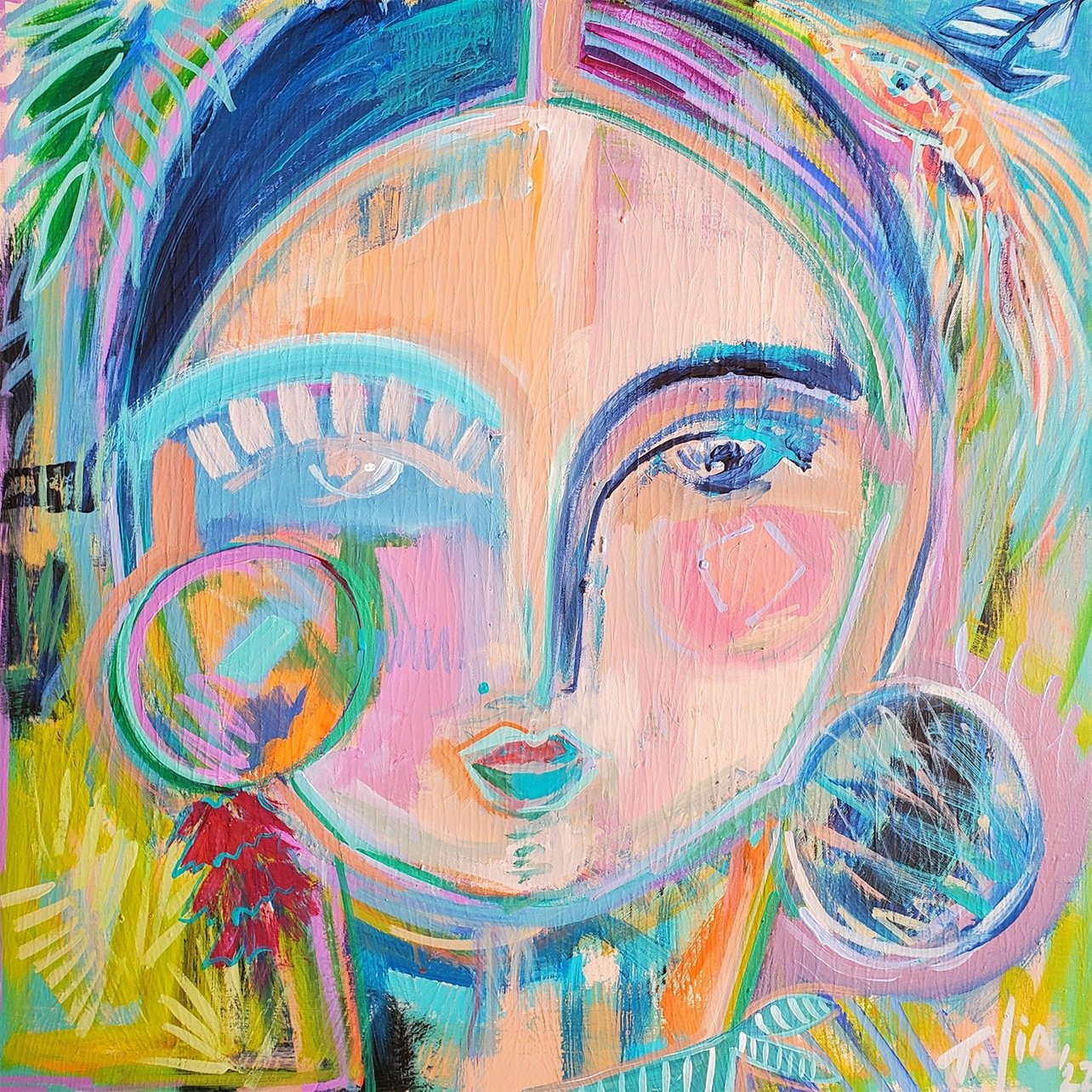
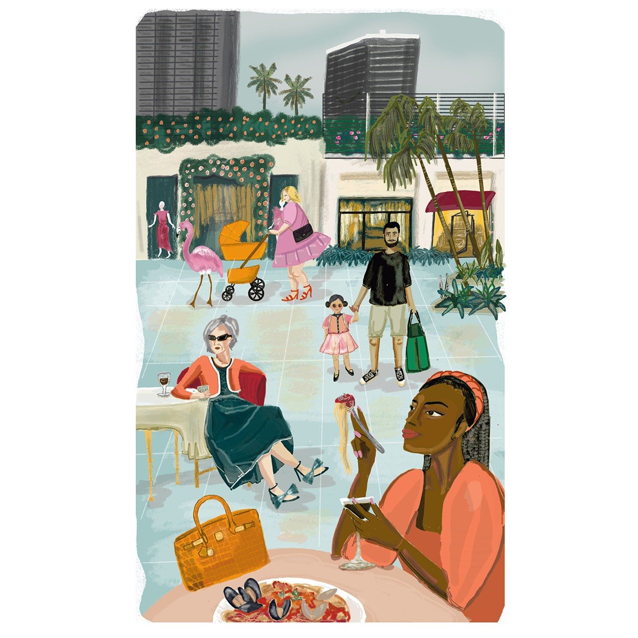
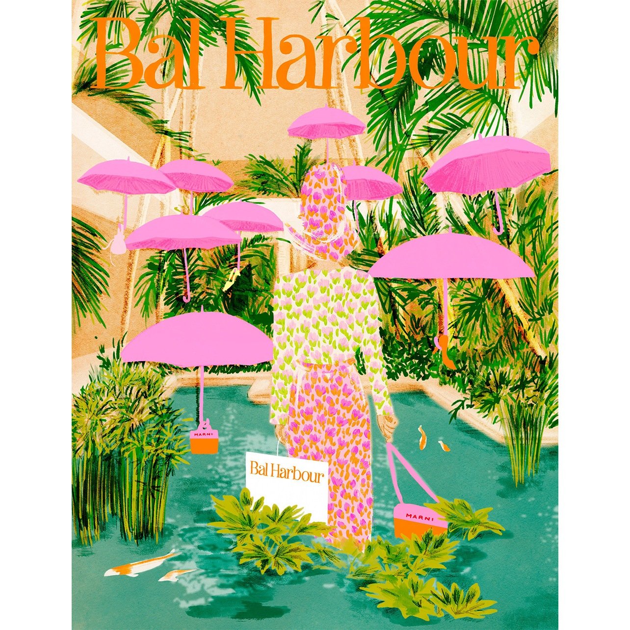
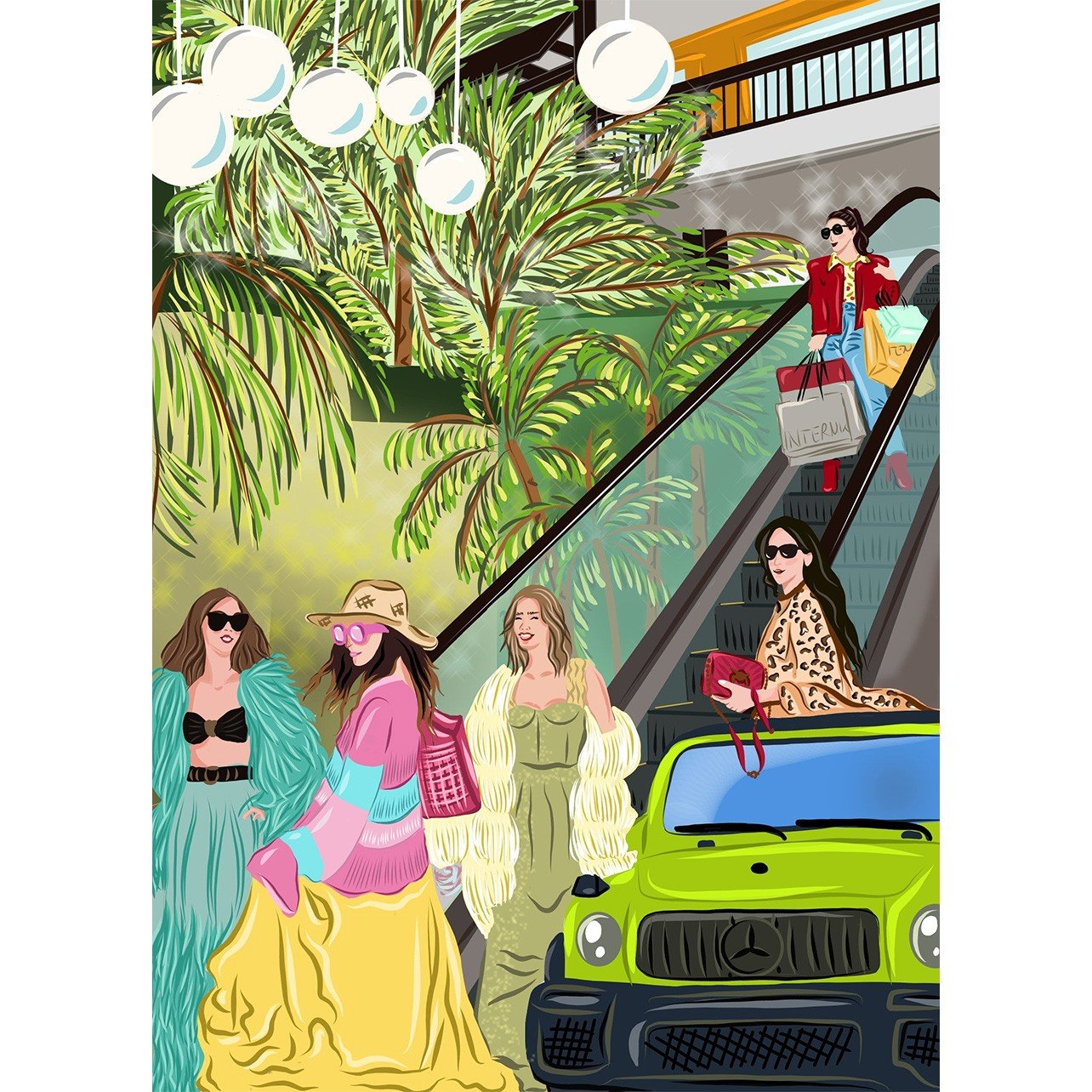
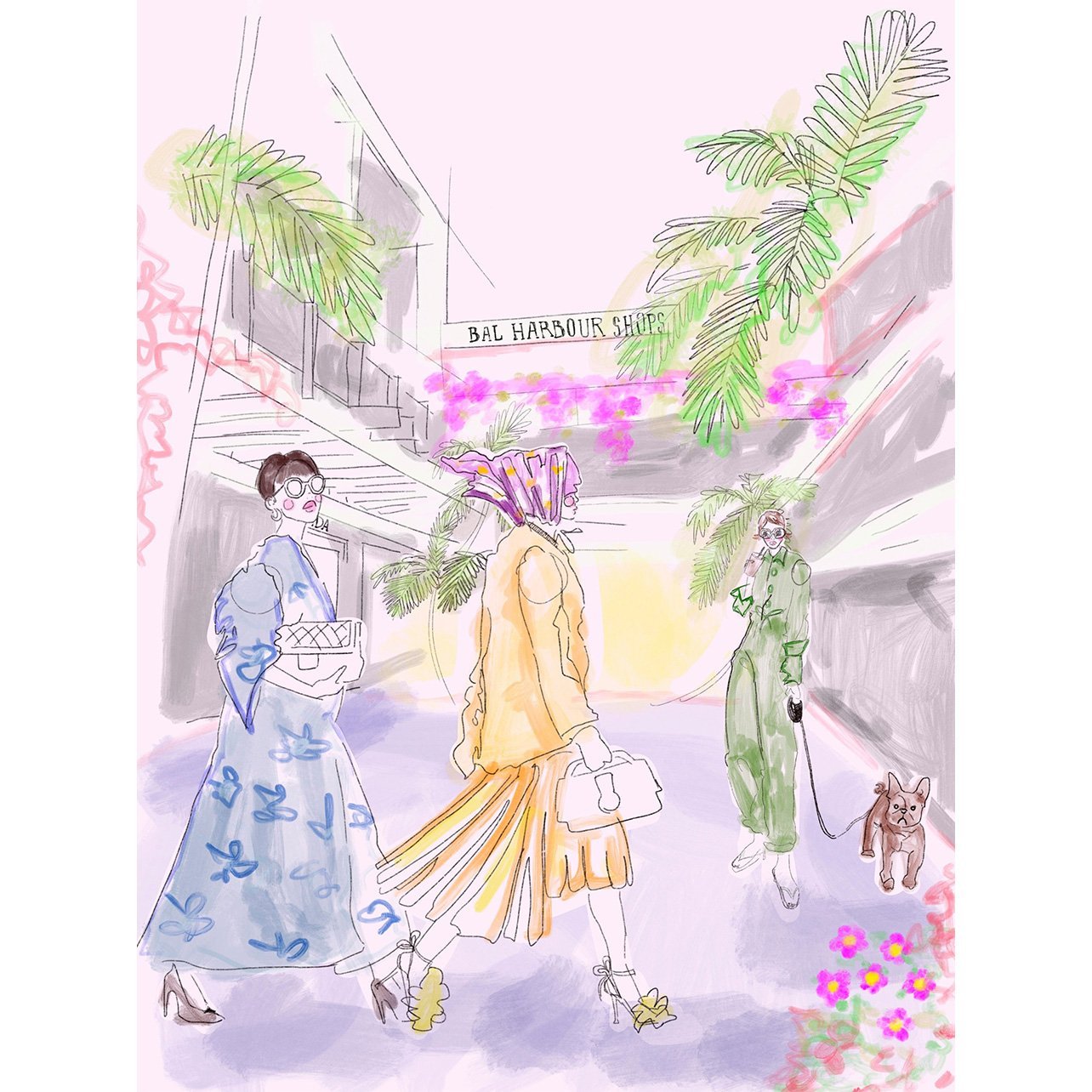
Below, scroll through to see our nine finalists’ entries, each capturing elements of Bal Harbour Shops in their own unique way.


Patricia Foriedland August 26, 2022 at 10:30 am
Wonderful choice of winner. Head and shoulders above the rest.
florence August 26, 2022 at 11:23 am
tentler Ktylov. is very talented ,
Bal harbour shops is a permanent fashion show which makes your shopping time very entertaining !!!!!!
Pauline August 30, 2022 at 10:52 am
Ms. Krylov couldn’t capture more perfect! Palm trees bringing that breeze to our dresses…Stunning work!